
After collecting some images while filming that we thought could work well on our movie poster, we decided to research films with similar narratives and similar settings as ours. These would give us ideas on what images and wording to include in our posters, so that we can target the correct audience and draw the right people in to see our film.
Brad has taken some very professional looking pictures of the outside of the house we were using to film in. With some exc ellent positioning of certain props, the images looked great and as a group we decided that we should try and incorporate this picture into our poster in some way. After watching some films and researching many more, we came across the poster for ‘Cold Creek Manor’ (Dir. Mike Figgis, 2003). This poster was very intriguing to us. There was an appealing house in the background that very expensive, yet very worn out at the same time. Most of the poster was filled up by long grass, and the colour scheme was a shade of brown and dark green, giving viewers connotations of suspicion and mystery. We liked this poster very much and thought it gave a similar effect to viewers as we wanted our poster to do. We decided to try and incorporate our picture of the house in a similar way to this.
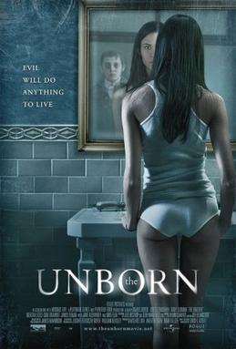
Another set of excellent photographs that were taken at our location were of my character looking into a mirror, seeing a reflection of himself, but also seeing one of a man behind him, with his back to him. We immediately liked these pi ctures and though they gave off a very tense feeling and gave the audience many enigmas, and left them wondering who both of these characters were. After researching similar film posters, we came across one for ‘The Unborn’ (Dir. David S. Goyer, 2009). This also had a character looking into a mirror, and seeing a reflection behind them. We liked the creepy look of the character behind, and the colours used (grey, white, silver) gave the impression of a supernatural being, one of the ideas we had for Brad’s character. After much discussion, we decided to try to incorporate both images into the same poster, as we thought this would give it a complex feel, and would make the audience want to come and see the film to find out answers.
Below is our completed poster. We are very happy with the final product and feel that if this was shown around the internet and at outdoor places (a bus stop, for example) it would shock people and make them wonder what the story was about. We want people to be intrigued by the images shown, so that they will become interested and come to see the film.
Brad has taken some very professional looking pictures of the outside of the house we were using to film in. With some exc
 ellent positioning of certain props, the images looked great and as a group we decided that we should try and incorporate this picture into our poster in some way. After watching some films and researching many more, we came across the poster for ‘Cold Creek Manor’ (Dir. Mike Figgis, 2003). This poster was very intriguing to us. There was an appealing house in the background that very expensive, yet very worn out at the same time. Most of the poster was filled up by long grass, and the colour scheme was a shade of brown and dark green, giving viewers connotations of suspicion and mystery. We liked this poster very much and thought it gave a similar effect to viewers as we wanted our poster to do. We decided to try and incorporate our picture of the house in a similar way to this.
Another set of excellent photographs that were taken at our location were of my character looking into a mirror, seeing a reflection of himself, but also seeing one of a man behind him, with his back to him. We immediately liked these pi
 ctures and though they gave off a very tense feeling and gave the audience many enigmas, and left them wondering who both of these characters were. After researching similar film posters, we came across one for ‘The Unborn’ (Dir. David S. Goyer, 2009). This also had a character looking into a mirror, and seeing a reflection behind them. We liked the creepy look of the character behind, and the colours used (grey, white, silver) gave the impression of a supernatural being, one of the ideas we had for Brad’s character. After much discussion, we decided to try to incorporate both images into the same poster, as we thought this would give it a complex feel, and would make the audience want to come and see the film to find out answers.
Below is our completed poster. We are very happy with the final product and feel that if this was shown around the internet and at outdoor places (a bus stop, for example) it would shock people and make them wonder what the story was about. We want people to be intrigued by the images shown, so that they will become interested and come to see the film.

- Taylor Gladwin
No comments:
Post a Comment